Switching Skins *
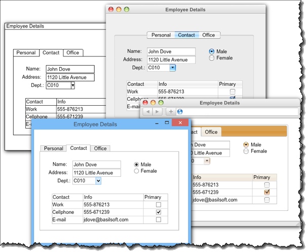
Skins change the look and feel of your mockups. It’s common to start with black & white mockups, and later on, switch to more realistic skin:
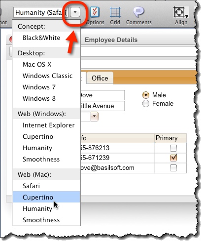
To switch to another skin, choose one from the top toolbar:
Black & White Skin *
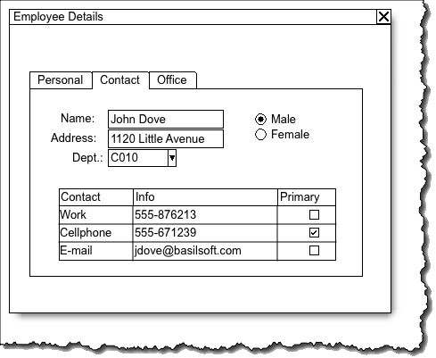
The Black & White skin’s purpose is to clearly demonstrate your screens are only mockups – a wireframe clarifying structure and functionality:
Mac and Windows Skins *
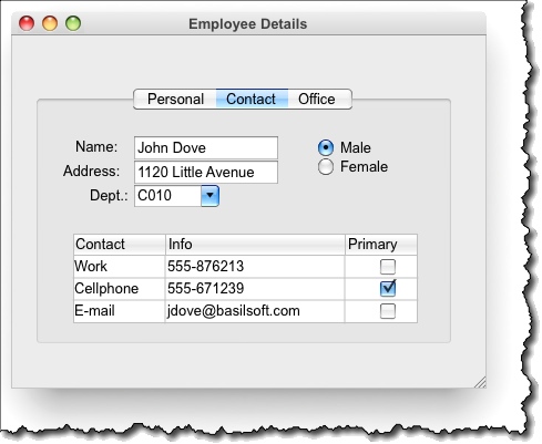
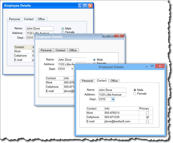
Available desktop skins are:
- Mac OSX
- Mac OSX Classic
- Windows Classic
- Windows 7
- Windows 8
Web Skins *
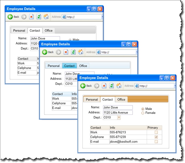
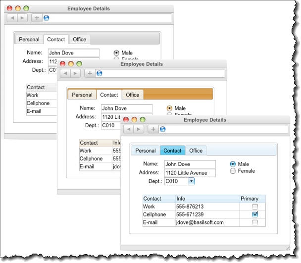
There are three distinct web skins:
- Humanity
- Cupertino
- Smoothness
Each comes in two flavors: MS Internet Explorer and Safari.
- MS Internet Explorer variants:
- Safari variants:
Customizing an Existing Skin *
To customize an existing skin:
- Copy the skin you want to customise.
- Customize it according to the same instructions as for creating your own skin.
Creating Your Own Skin *
Skin Mechanism *
Skin mechanism makes it very simple to create new skin for existing widgets, currently existing widgets are button, checkbox, dropdown, field, form, frame, line, list, marks, radio, tab, table, text, tree. For each of these widgets, images can be assigned which define how each widget looks
Basic Structure *
Application looks for folders inside skins folder: if any folder has valid skin.xml file, that skin will be loaded in application and user can choose that skin for widget display. So skin.xml defines tags for each widget and associated colors, fonts, and images, etc.
Skin XML Format *
Root tag is skin and it contains the following tags
- name – defines the displayed name of skin also used as identifier
- description – text describing the skin, not yet shown anywhere in
application - canvas_background_color – background color for widget editor
screen - grid_color – color of the grid lines in editor screen
After that come the tags describing each widget skin. Widget tags are defined in a hierarchical order, where, for each widget, we need to define widget skin properties for normal and disabled state (if needed) and these properties are first inherited from Basic properties defined in BaseWidget and BaseWidget_disabled.
BaseWidget_disabled again inherits properties from BaseWidget so graph would be something like:
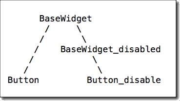
So, basically, we override or add things in inherited widgets and other states.
BaseWidget *
It defines the basic properities used by every widget and every state (for now, disabled state), e.g.:
- selection – This tag defines the color for selection rectangle and image to be used for resize handles.
- text – This tag defines text color and font to be used by each widget; of course, each widget can override any such property later on.
- default_background_color – this is the color to be used by widget for drawing background if it needs to do some pixel level drawing, otherwise, mostly images are used.
- default_foreground_color – this is the color to be used by widget for drawing foreground, e.g., lines if it needs to do some pixel level drawing, otherwise, mostly images are used.
- scrollbar – two scrollbar tags are used to define vertical and horizontal scrollbar, each widget after that uses same scrollbar but if needed, a widget can use its own scrollbar by overriding this tag. Scrollbar is defined by four images, which are images for slider, background, and two thumb tracks at both ends.
So such properties are used by all normal and disabled widget, BaseWidget_disabled overrides some of these properties to give a feel of disabled state, e.g., changing selection color and text color. Also, BaseWidget_disabled defined a new property overlay_image, which is overlayed over the widget. It is optional and can be used by other widget states, e.g., to give highlight or disabled state effect. Windows skin in disabled state doesn’t use any overlay as it defines new images for each widget in disabled state, Black & White skin doesn’t define new images for each widget but instead, overlays a dotted array image in disabled state.
Once we have defined BaseWidget and BaseWidget_disabled, we can define individual widget tags and override or add whatever we need for that widget. Most of the widgets define a background_image tag, which defines the background of widget over which widget text is drawn.
Compound 8+1 Image *
At various places where we need stretchable images, e.g., background of form or button or tab image, etc., we use a Compound image consisting of nine (9) images, i.e., 8 border images (top left, top, top right, left, right, bottom left, bottom and bottom right) plus a middle image. So, when a button say 30 *100 size is to be displayed, its border is drawn with border images and middle is filled with middle-image. Border images are not resized in thickness and middle image is stretched to fit both width and height.
<background_image>
  <top_left>button/TL.bmp</top_left>
  <top>button/T.bmp</top>
  <top_right>button/TR.bmp</top_right>

  <left>button/L.bmp</left>
  <middle>button/M.bmp</middle>
  <right>button/R.bmp</right>

  <bottom_left>button/BL.bmp</bottom_left>
  <bottom>button/B.bmp</bottom>
  <bottom_right>button/BR.bmp</bottom_right>
</background_image>
Any of the 9 images can be skipped, so if no middle image is given, the widget will become transparent with a border, or if only middle image is given that only that image would be stretch fitted to widget background. This can also be used to create:
<background_image>
  <top_left>button/TL.bmp</top_left>
  <top>button/T.bmp</top>
  <top_right>button/TR.bmp</top_right>

  <left>button/L.bmp</left>
  <middle>button/M.bmp</middle>
  <right>button/R.bmp</right>

  <bottom_left>button/BL.bmp</bottom_left>
  <bottom>button/B.bmp</bottom>
  <bottom_right>button/BR.bmp</bottom_right>
</background_image>
Compound Image Attributes *
Possible attributes for compound images are:
- offset_left
- offset_right
- offset_top
- offset_bottom
- padding_left
- padding_right
- padding_top
- padding_bottom
- border_top
- border_bottom
- border_left
- border_right
- stretch_x
- stretch_y
Default values:
- For borders: None
- For offset and padding: 0
- For stretch: True
Extra Widget Tags *
As stated earlier, most of the widget need to define only background_image to change its look, but sometimes, widgets would need extra images and it may differ from widget to widget, so below such
other extra tags are defined for each widget:
- Dropdown – it uses optional_image1 and optional_image2 to define
image for dropbox and arrow inside it. - Checkbox/Radio – it uses optional_image1 and optional_image2 for
check and unchecked images. - Tab – it defines a composite image tab_image for tabs.
- Form – it uses several images to create a Form look
- caption_text – defines the text color and font.
- caption_controls_image – defines the images used for min/max/close buttons on caption.
- caption_image – defines the composite image used for caption background.
- menu_image – defines the background of menu bar.
- client_image – defines the composite image used for form client, i.e., area below caption/menu.
- Tree – it uses optional_image1 and optional_image2 for node and leaf images.
- Table – defines two new tads
- header_image – composite image for header of table.
- grid_line_color – for color of table body grid lines.
- Line – it doesn’t use any background (although it can) and just uses optional_image1 for line image.
- Marks – it is a totally different widget because it doesn’t use any static background as such but different type of marks are displayed as different images. So the marks tag defines all such images in hierarchical structure of mark_group and mark.
Creating New Skin *
To start, copy the folder of already existing skin, rename it, and start changing the various properties in skin.xml. Change the image as per your liking and you will have a new skin, e.g., to create a new Mac style button, copy the image of such button in an image editor, identify its border and the middle part and cut it into 9 pieces, create separate image for each piece, put it into a folder inside your widget folder, and put that path in widget xml.
Note: it is not necessary to create such a hierarchical folder structure for widget images and sub images of widgets as skin.xml can take any path but it would be good practice and easy to maintain.